
For the Love of Letterpress
Join me for a behind the scenes peek into the studio of Dexterity Press, where the broadsides for Silent Anatomies were made. Producing these poems with this unique process was an enjoyable collaboration made possible by Jeff Mueller who patiently fielded my ideas and was willing to go the extra mile to translate those ideas into one-of-a-kind art pieces.
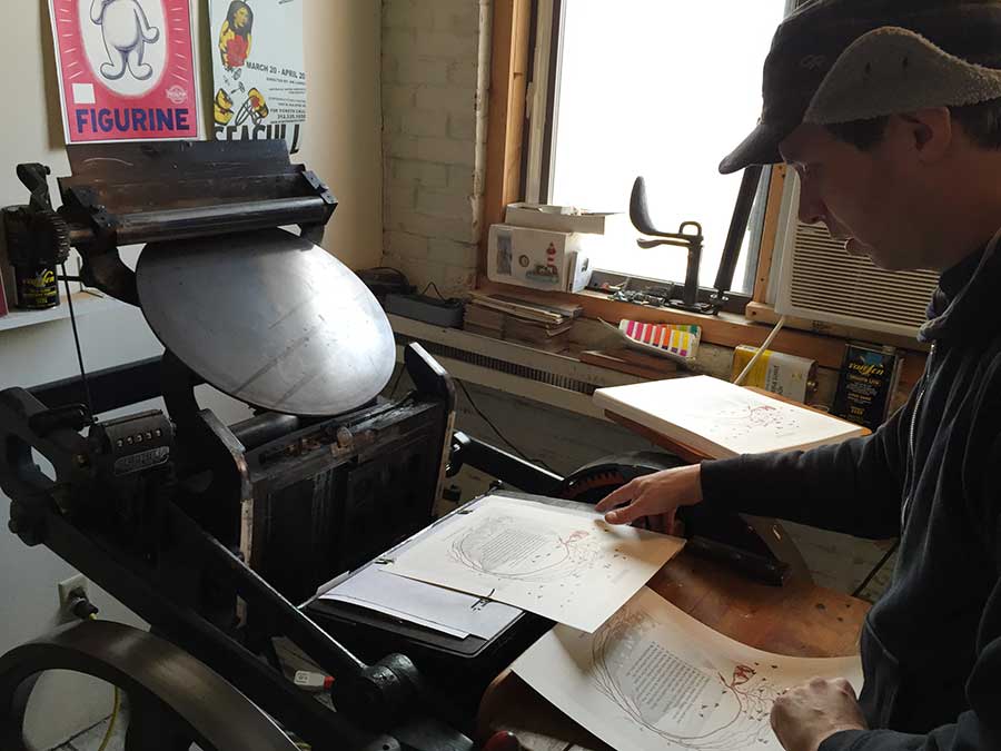
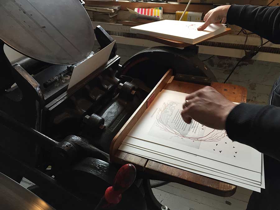
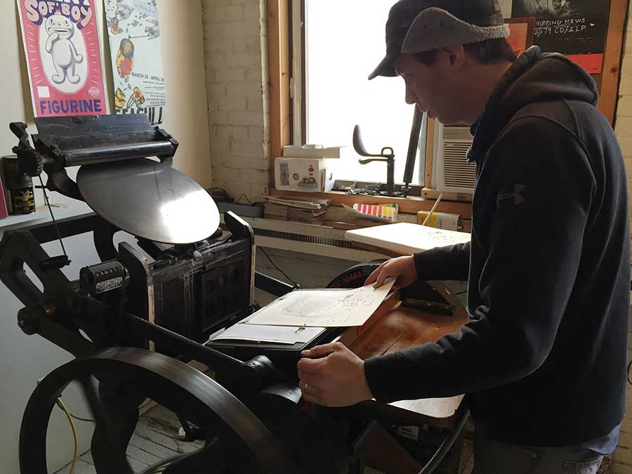
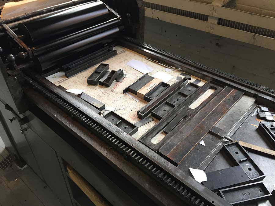
GALLERY: Each broadside is printed on a Vandercook Universal 1 proof press using wood-mounted 16g magnesium dies on luscious archival paper, 100lb Mohawk Superfine softwhite, eggshell finish. The other press that you see above is used to do blind embossing.
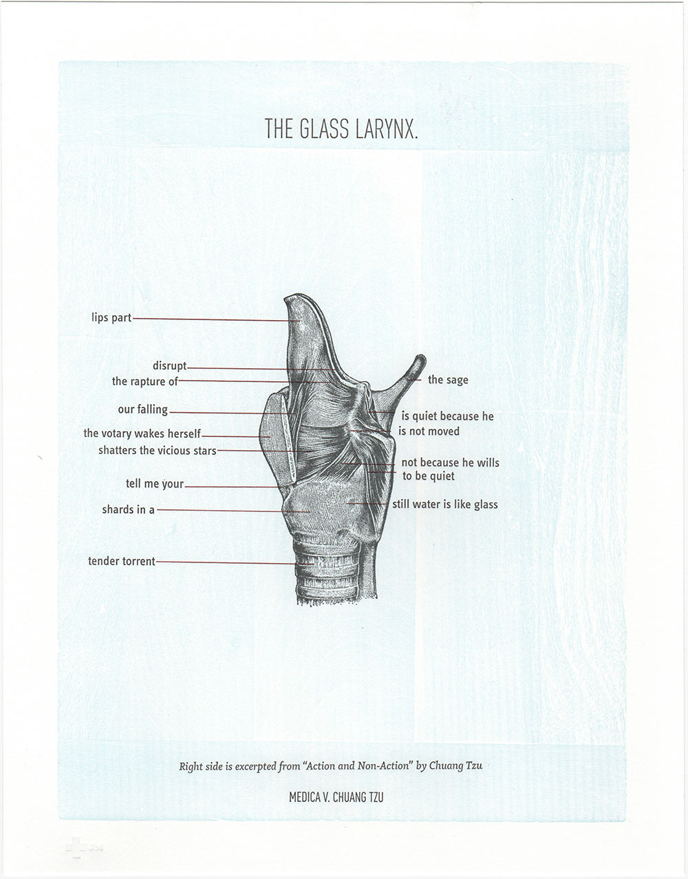
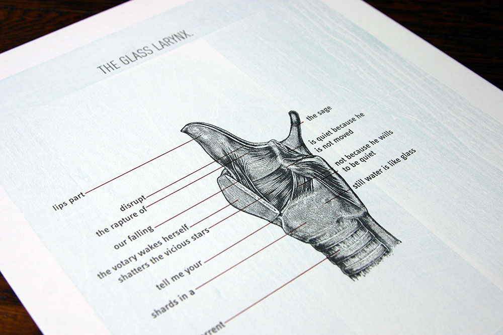
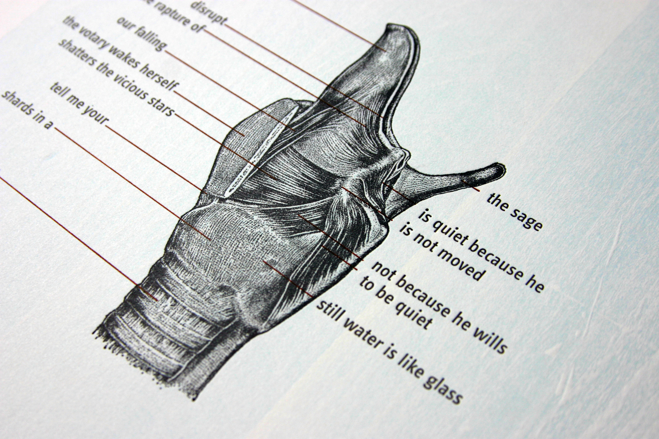
Collaboration is key to the success to making a design distinct for letterpress. I learned that it is not at all like the digital prepress work that I'm so used to doing. Rather, even when at press, there is a bit of improvisation and resourcefulness that goes on to make all the visual elements and text work together. For example, my original images of the poems are layered on scans of pages of vintage medical books. We wanted something that felt more tactile so Jeff suggested using natural woodblocks that feature beautiful grain textures. We also experimented with background colors that were different than the off white of the originals. The results were astounding. Below is "The Glass Larynx" which has a robin egg blue background, evoking a kind of fragility and translucence.
When planning these it's important to consider what the final context will be. In this case, I wanted something that readers and art lovers could collect and easily bring home from book signings. I also wanted these to display well together in gallery spaces. Even though each work was created individually at different times, when presented together, they will visually talk to each other and therefore it's important to make choices that allow them to harmonize.
We discussed choices that would make each work distinct, such as using complementary hues for each background. To unify them typographically as a series Jeff also shifted some type to have similar placement across all three pieces. Having two people with a real appreciation for type and design definitely made this more than just printing a page, it's actually more about translating a poem into the realm of precious object.
With patience and the ability to make room for surprise, we are then able to feel the joy of astonishment.